Redefining digital onboarding for the world’s leader in shipping and logistics.
UPS Digital Onboarding
Overview
UPS initiated a project to improve its digital onboarding process for new customers. The primary objectives were to redesign various onboarding flows, including but not limited to sign-up and account creation, for both individuals and businesses. As an experience designer and strategist, I collaborated with marketing, engineering, and experience teams. My role involved leading web app redesign, creating user personas, developing customer journey maps, and facilitating workshops.
Highlights
Launched different onboarding flows in addition to multiple experience deliverables including experience maps, user flows and personas.
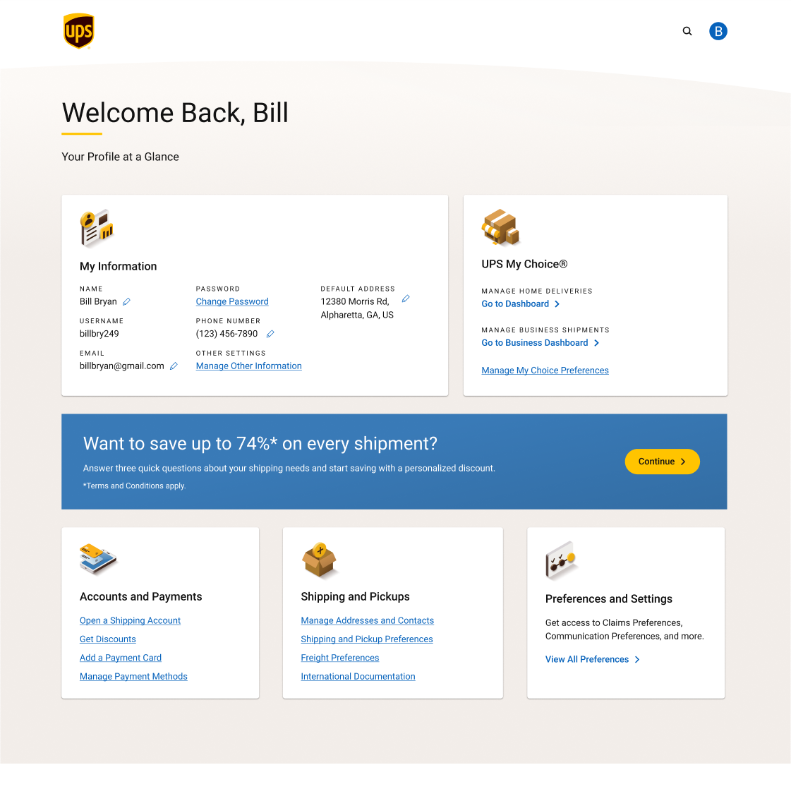
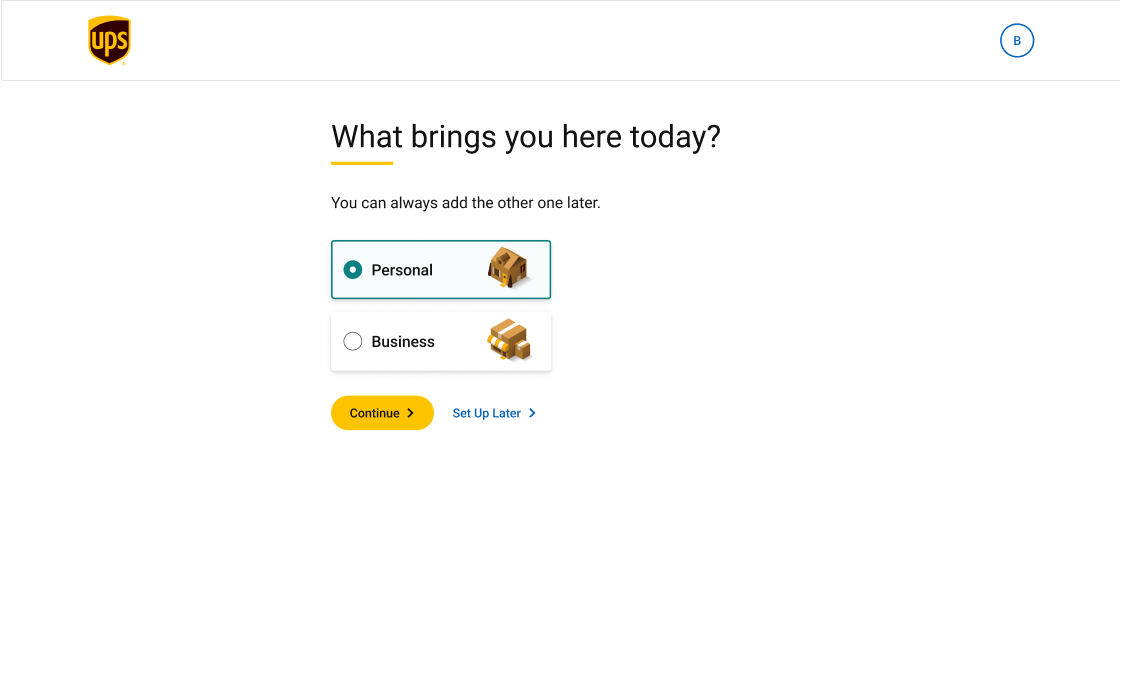
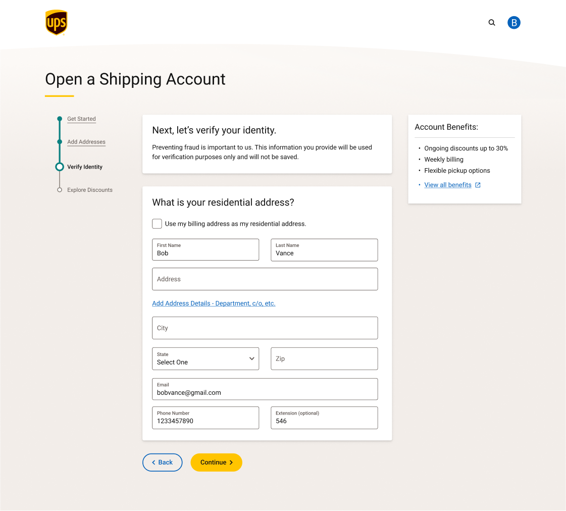
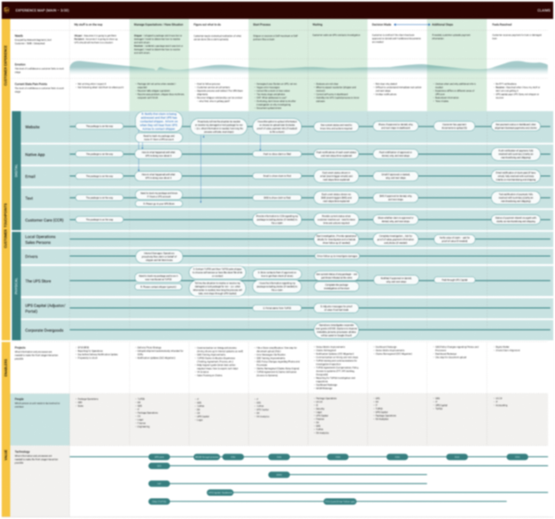
Image Blurred Intentionally
Process
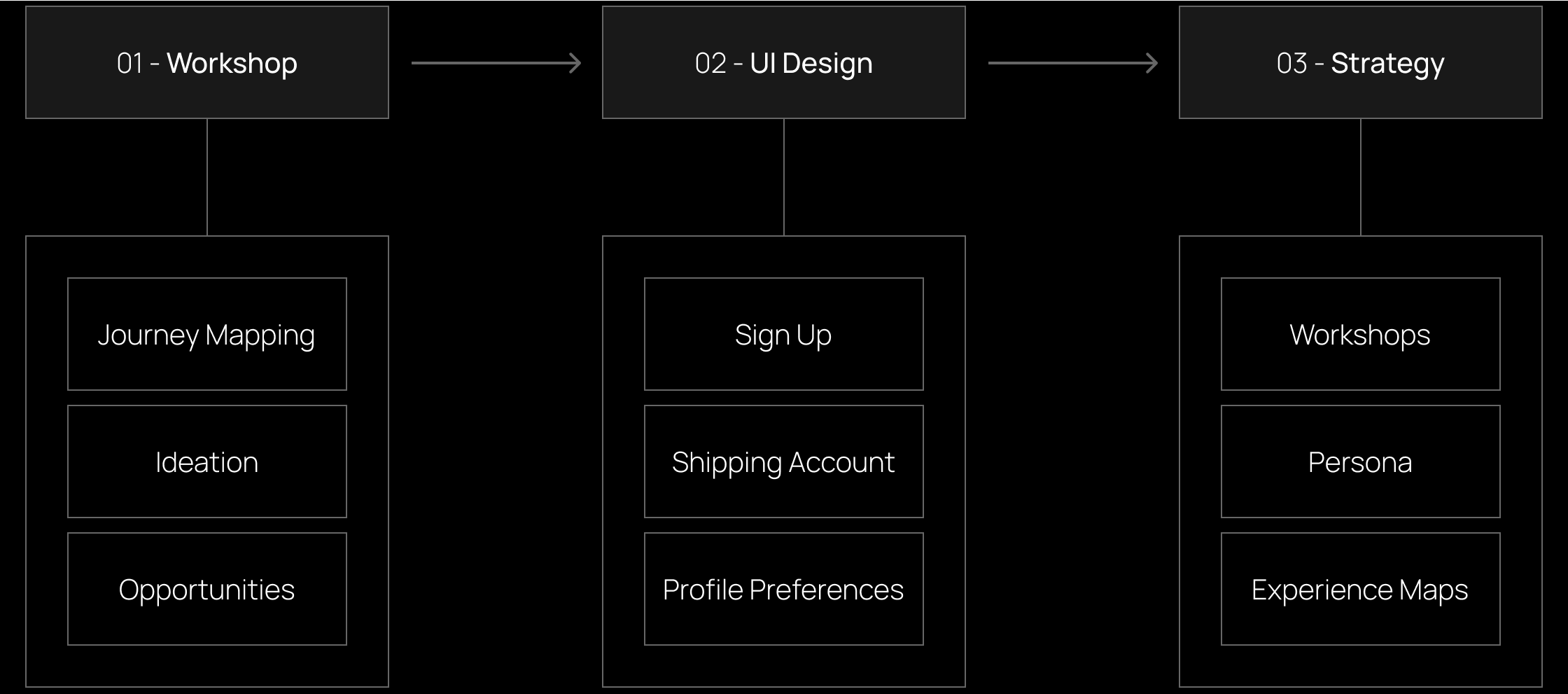
- 01 - Workshop:
2-day workshop with different departments from UPS to gather additional insights into how UPS work and the ways onboarding team can improve work. The team was able to generate different design objectives that were implemented in the next step. - 02 - UI Design:
The onboarding design team implemented different flows highlighted above after conducting multiple qualitative and quantitative studies with the research team. I led a team of 3 to redesign 100+ pages of the profile preferences web app. - 03 - Strategy:
After delivering improved results and building trust, the onboarding team ran more generative workshops that were centered on building the UX foundation of the design work over the next 2 years. Outcomes included customizable persona templates, experience maps, and ecosystem maps.
Workshop
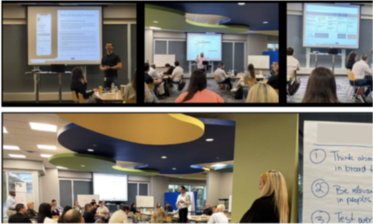
Multiple teams attended a 2-day workshop where they contributed to the onboarding team understanding of customer needs. These contributions were in the form of journey maps, ideations, design concepts and prototypes. The goal of this workshop was to align on customer needs by identifying current pain points and potential opportunities for both short-term and long-term.
In preparation for the session, research was compiled in FigJam and used to build customer profiles to analyze existing insights.
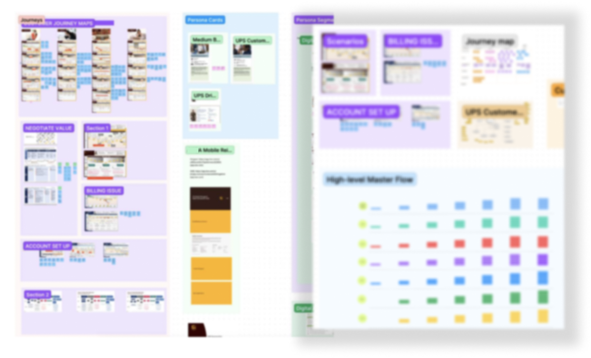
Image Blurred Intentionally
All the main onboarding flows were documented in diagrams similar to the one below, allowing all types of users (e.g. designers, marketing, research) to follow the logic of each step while having access to notes and screenshots for clarity.
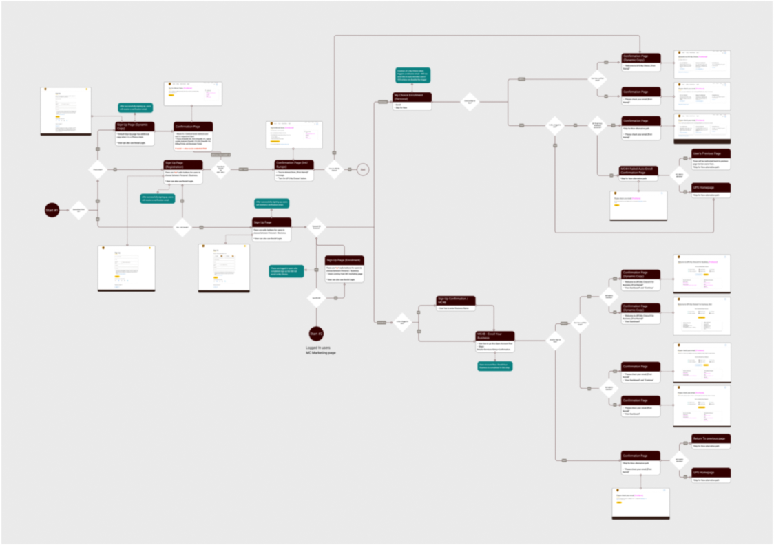
Image Blurred Intentionally
Over 2 days, the team identified different short-term opportunities which were picked up by onboarding design team. Those are highlighted next.
UI Design
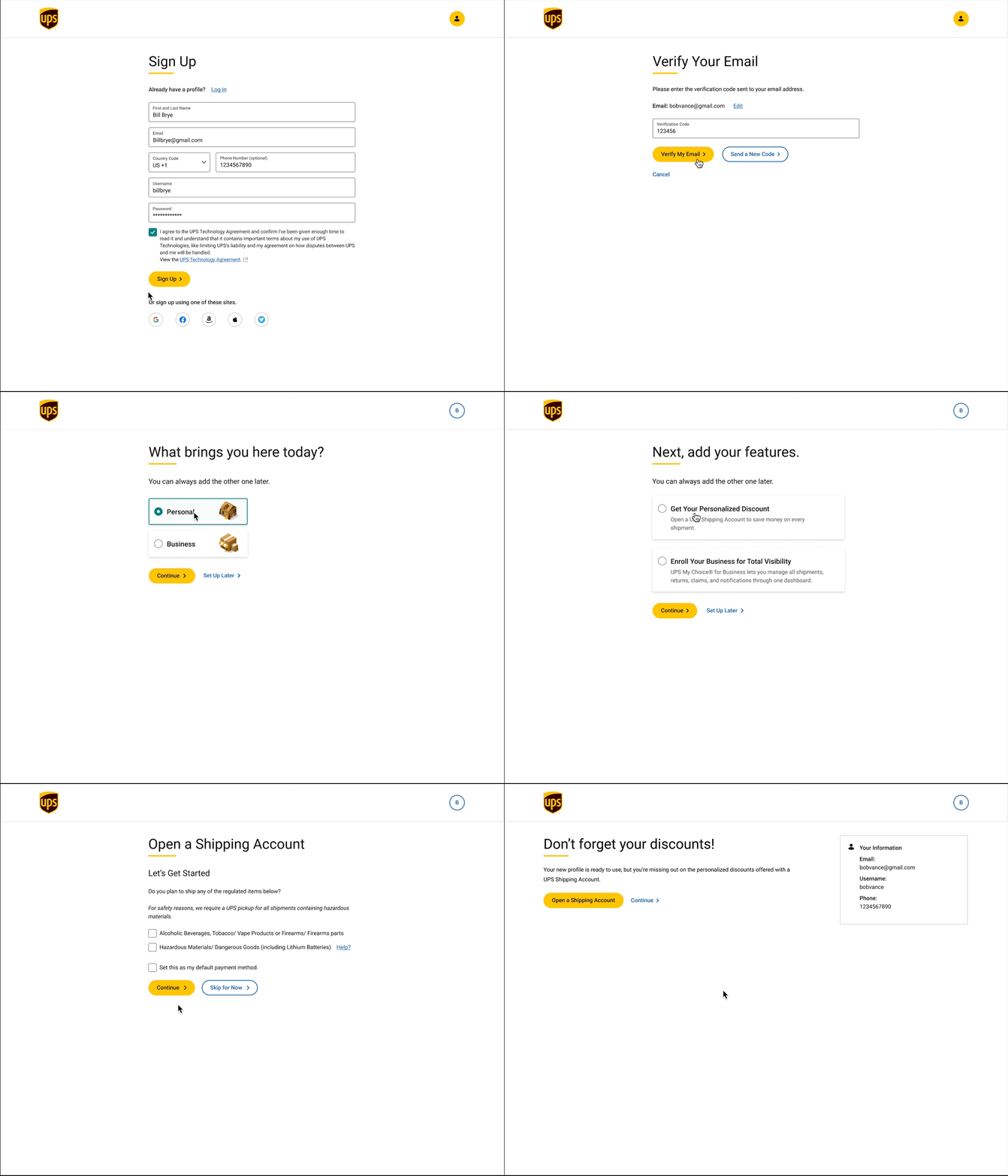
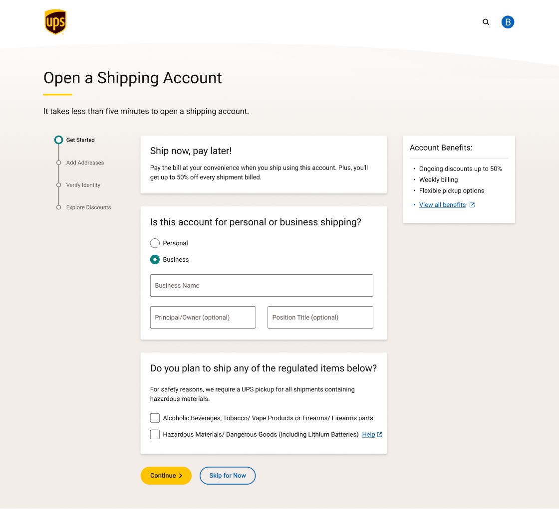
02 - Shipping Account, like Sign Up, the flow is broken into multiple steps and adopt a modular approach to components that will help in visually separating different topics and allow for better content authoring and marketing
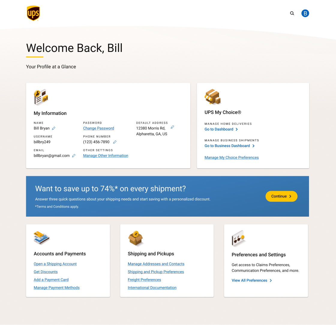
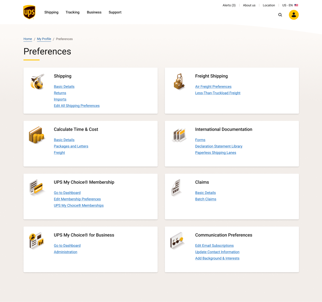
03 - For Profile Preferences, the main Profile Overview page was redesigned to adopt a modular approach where each module (i.e. tile) represents a UPS feature that customers can interact with. In addition, more than 100 sub-pages and modals were redesigned to adopt new design system components and consolidate tens of CSS stylesheets into a more organized workspace.
Strategy
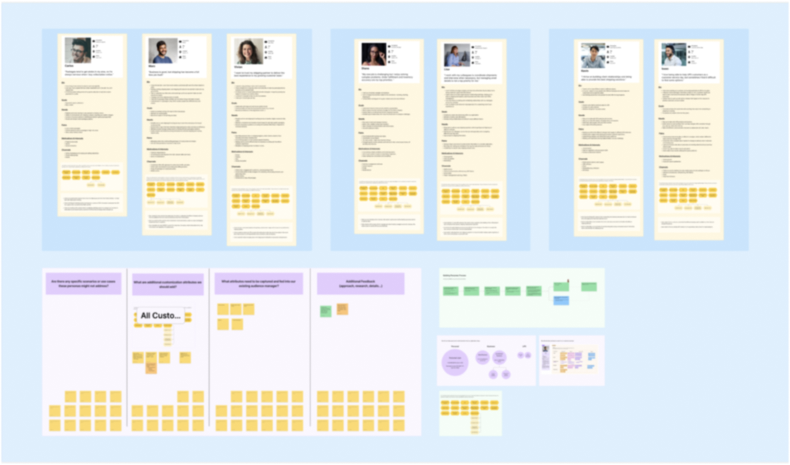
Image Blurred Intentionally
Each persona template has basic information in addition to customization fields on the right where internal users can adjust and build different variations of the same persona.
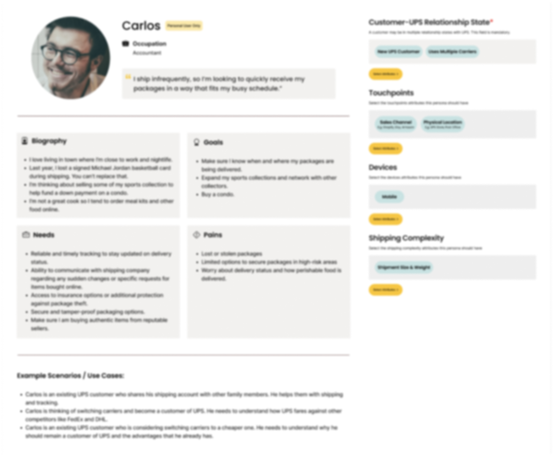
Image Blurred Intentionally
Workshop participants collaborated in groups to build customer journeys and ecosystem maps.
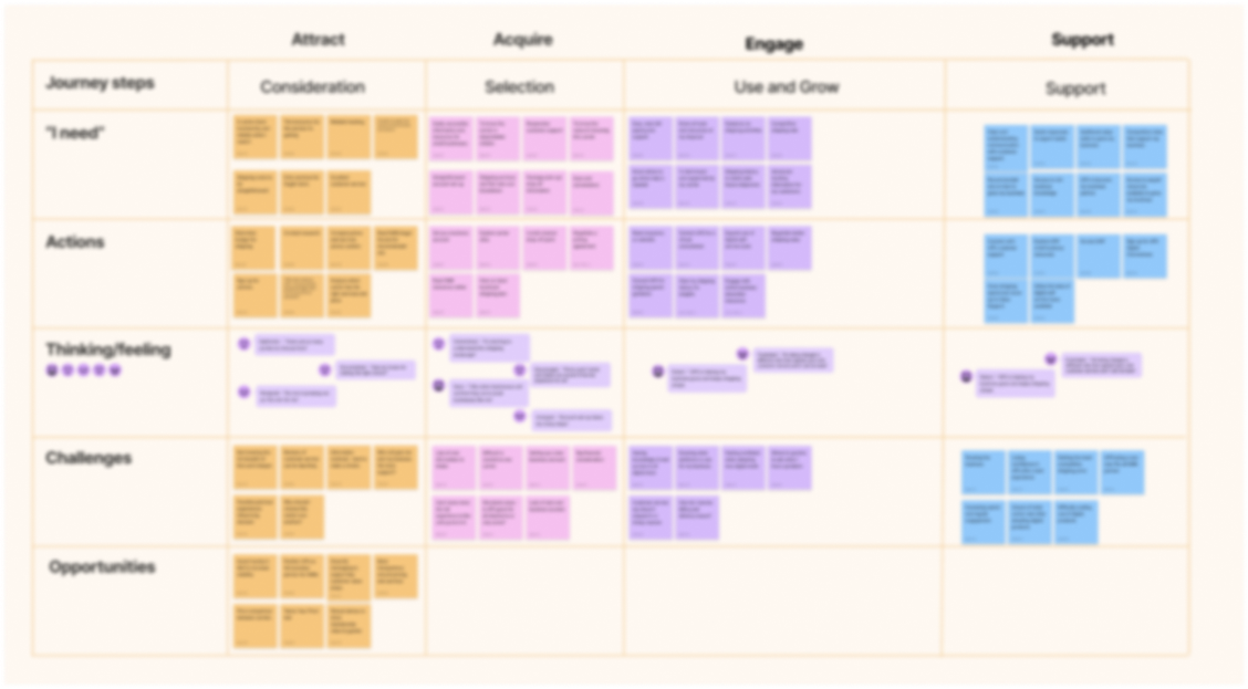
Image Blurred Intentionally
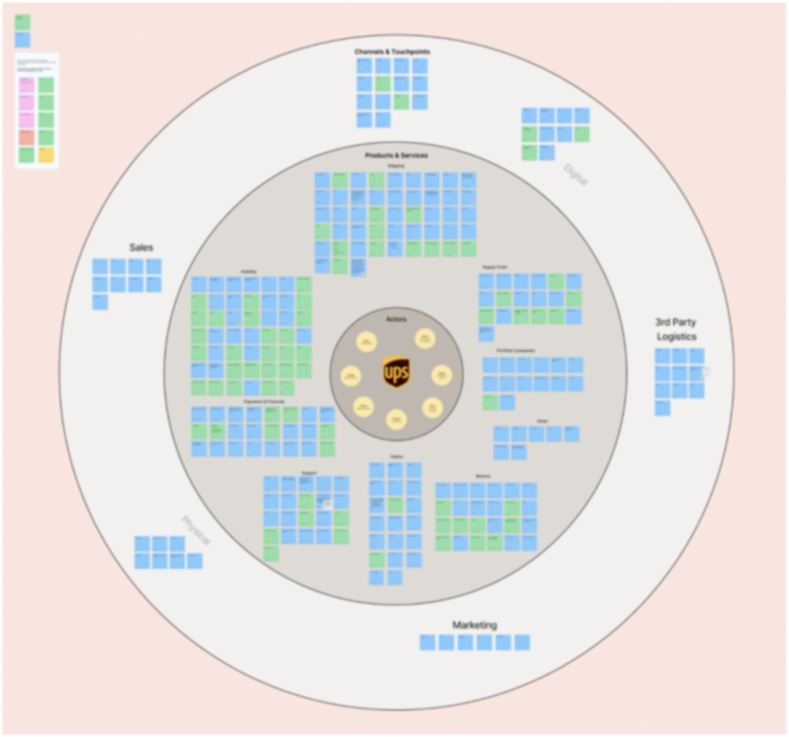
Image Blurred Intentionally
Impact
Future Improvements
- Faster UI handoff process to developers once layout is approved. This can decouple copy changes from design changes and give developers more time to work.
- Introducing research earlier in the design process can help address many business units questions regarding metrics.
- More 1-on-1 meetings to encourage each designer to bring their expertise and opinion to the table given the size of teams involved in most projects.