Building a design process that shipped an app, a theme editor, and a vision.
Pike13
Overview
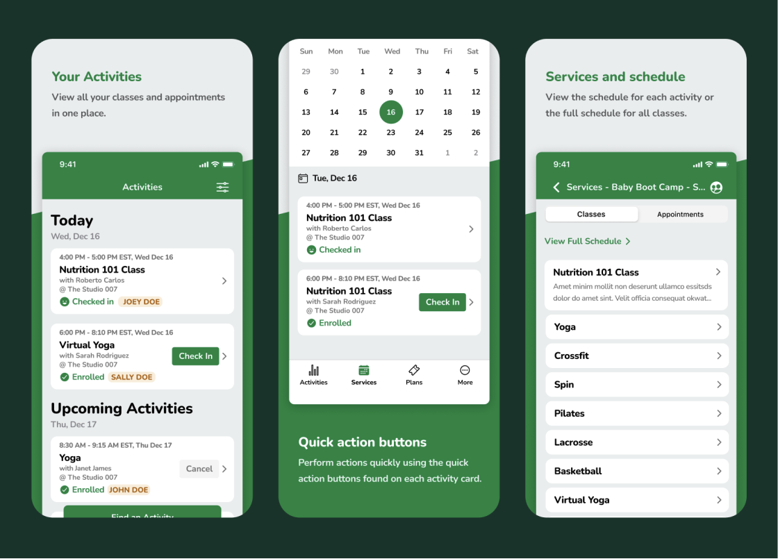
Pike13 needed to re-evaluate their client app due to customer requests. As the lead designer, I worked with the Pike13 engineering team to build a new React Native app for iOS and Android. The redesign added key features, improved white-labeling for business clients, and influenced design changes across Pike13's other products. This project ultimately reshaped the company's approach to design and research.
Highlights
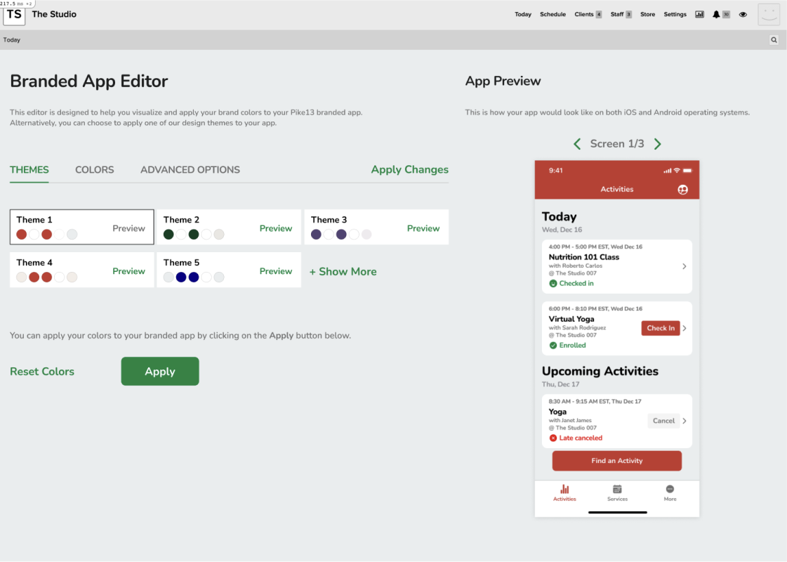
Launched a React Native client app for iOS and Android and a theme editor to customize white-label apps.
Process
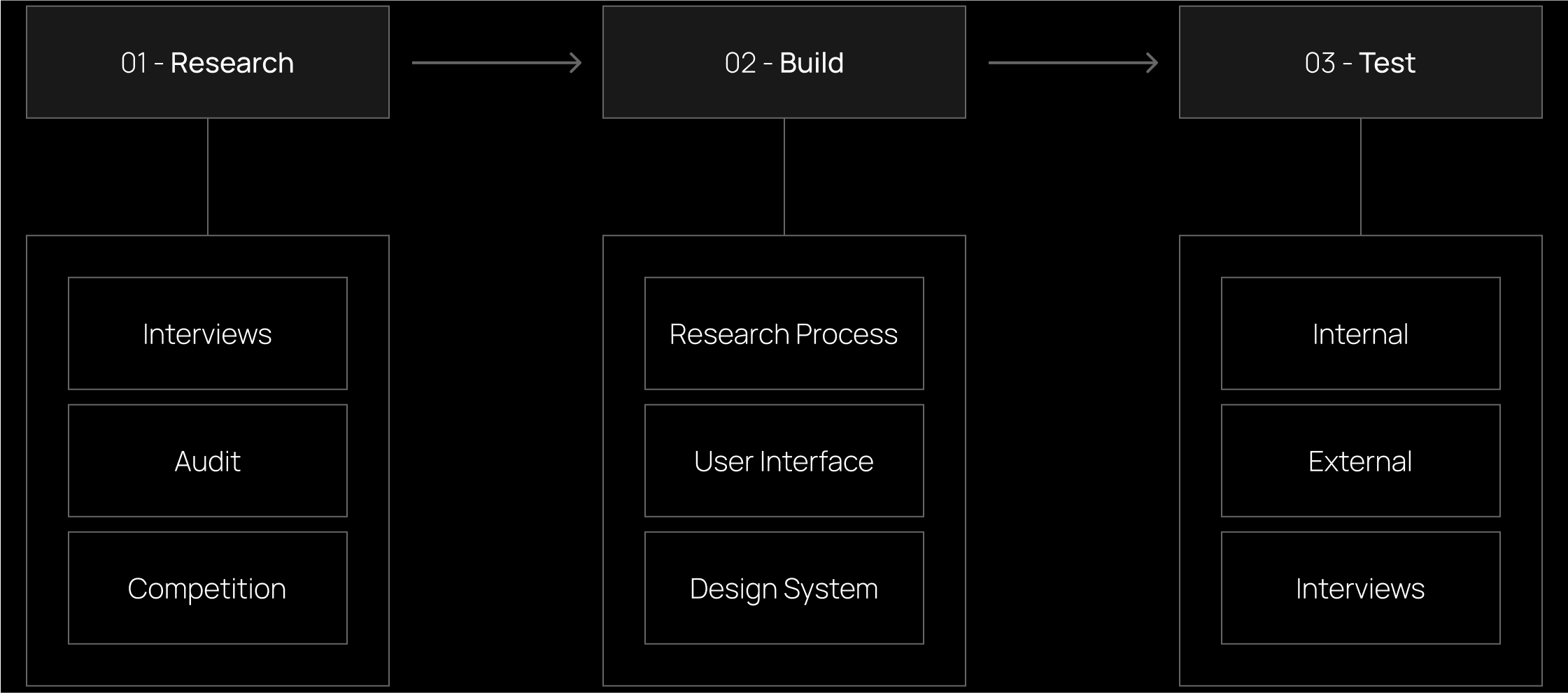
- 01 - Research:
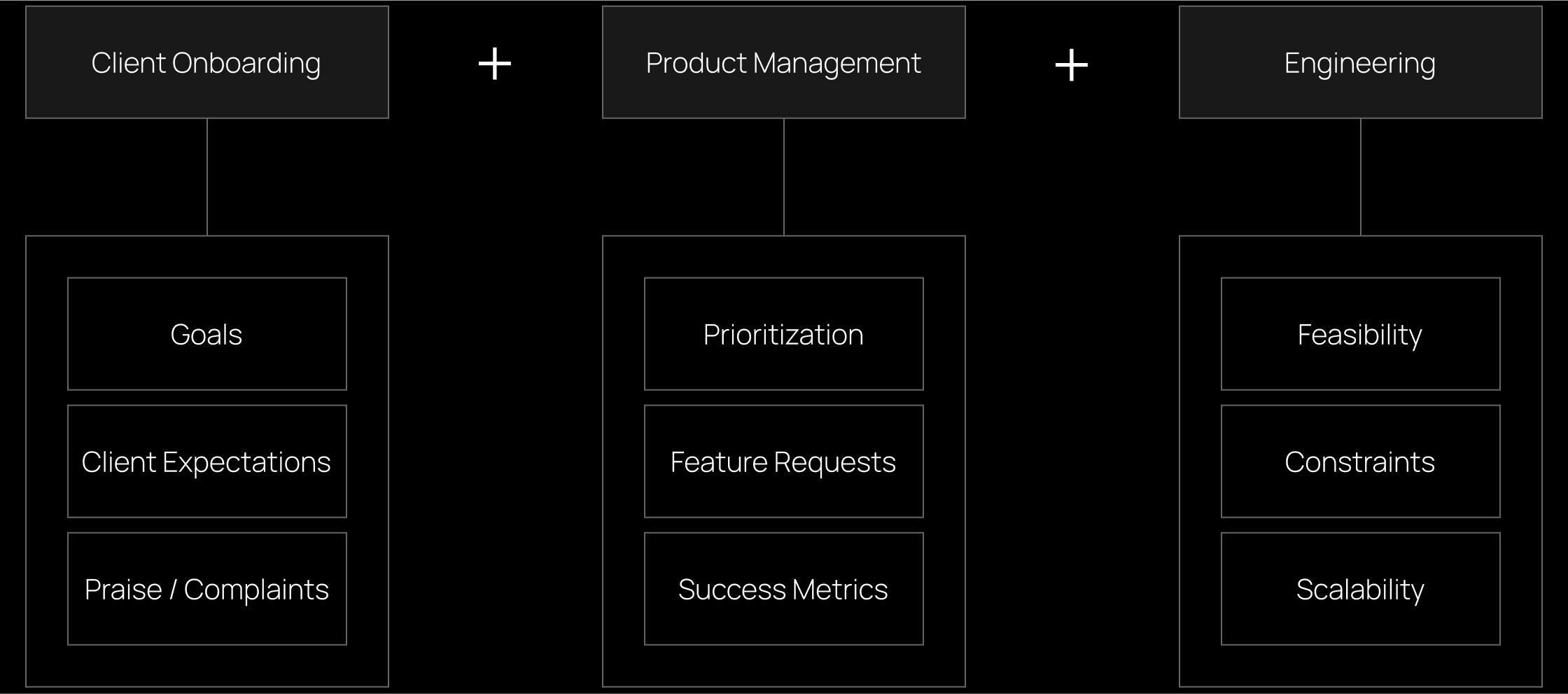
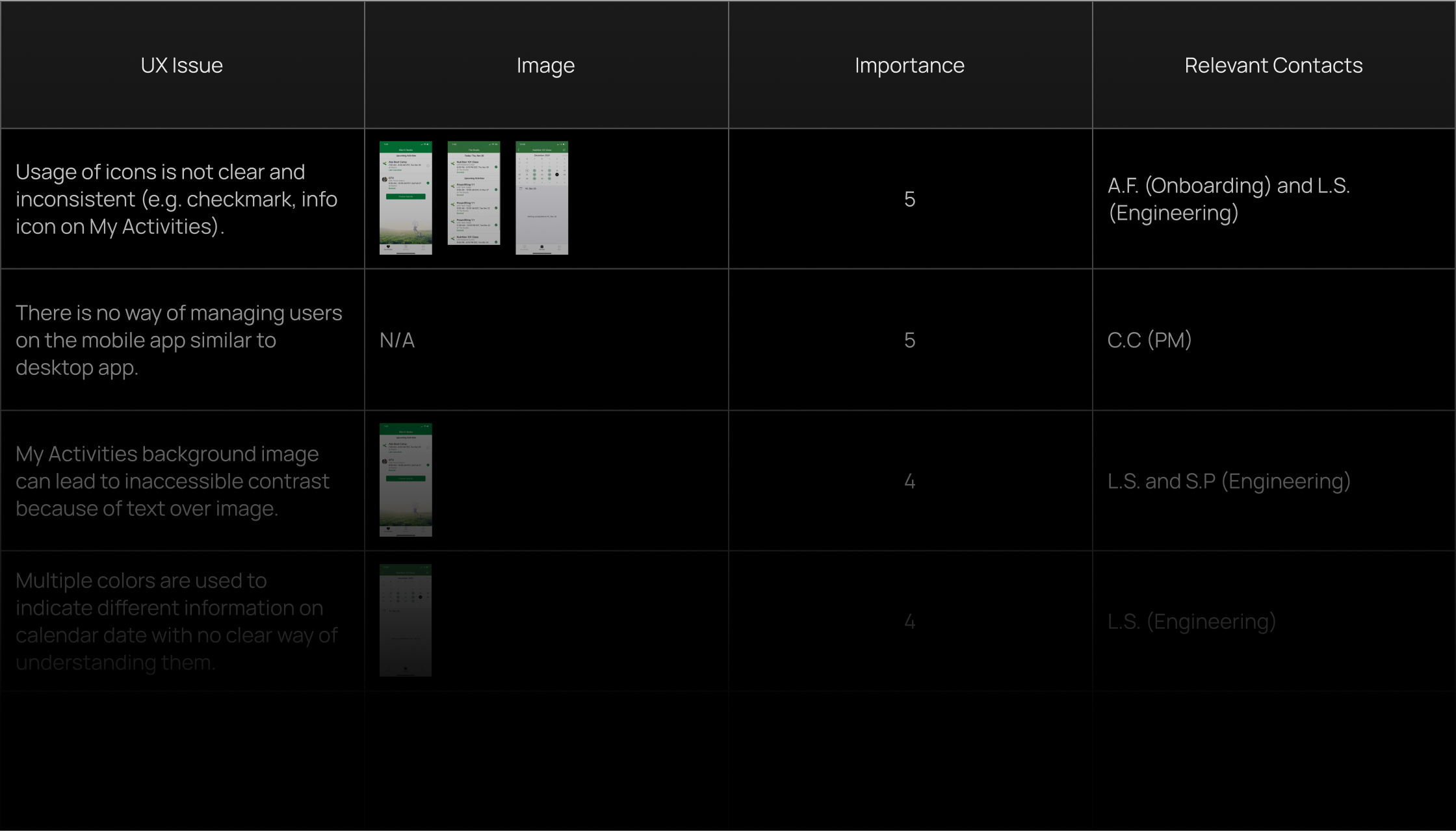
Project began with team member interviews to understand client app integration within company offerings. Time spent with customer onboarding team examining new business customer setup and challenges. Afterwards, I conducted UI and UX audit of Pike13 client apps to build design debt inventory and identify short-term opportunities based on industry best practices. Larger research effort followed to reimagine functionalities based on customer requests and competitive products. - 02 - Build:
The onboarding design team implemented different flows highlighted above after conducting multiple qualitative and quantitative studies with the research team. I led a team of 3 to redesign 100+ pages of the profile preferences web app. - 03 - Test:
After delivering improved results and building trust, the onboarding team ran more generative workshops that were centered on building the UX foundation of the design work over the next 2 years. Outcomes included customizable persona templates, experience maps, and ecosystem maps.
Workshop
For each team interviews, I had about 3 primary areas of focus to improve my understanding of the overall user experience. The diagram below illustrates each one of these primary focus areas and what I learned from each team:
UX audit was conducted to highlight the design debt the app has accumulated and present it to the company.
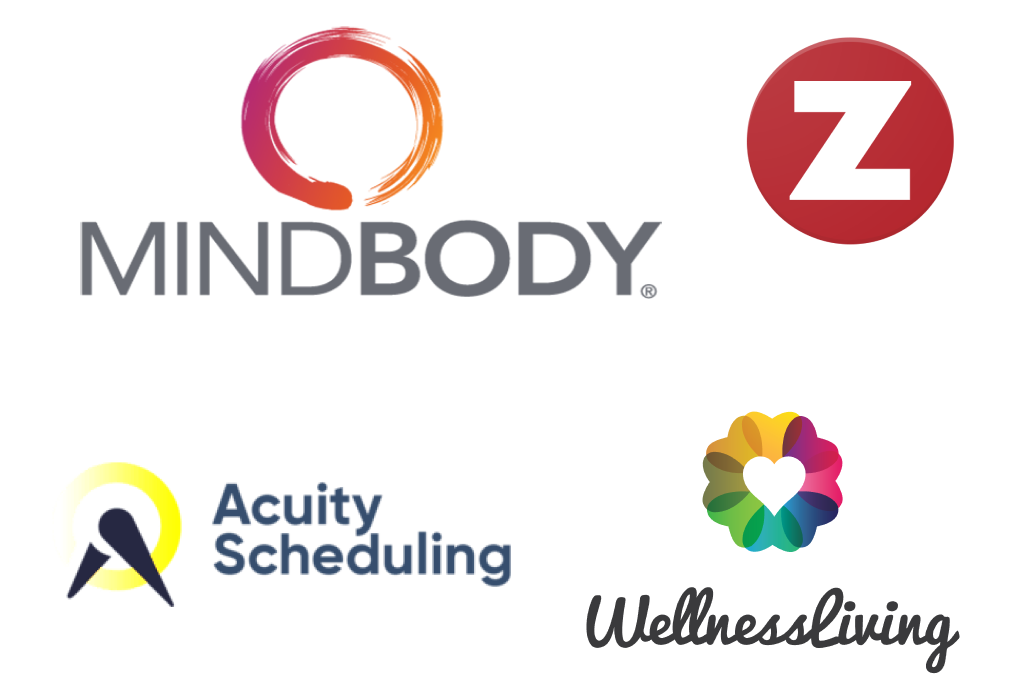
Competitor research revealed improvements or additions that can be applied to the client app such as quick actions, loading times and the visual look.
Build
Image Blurred Intentionally
The design adopts a modern look and layout, with each main page accessible from the bottom navigation bar where the user can access additional and directly linked sub-pages.
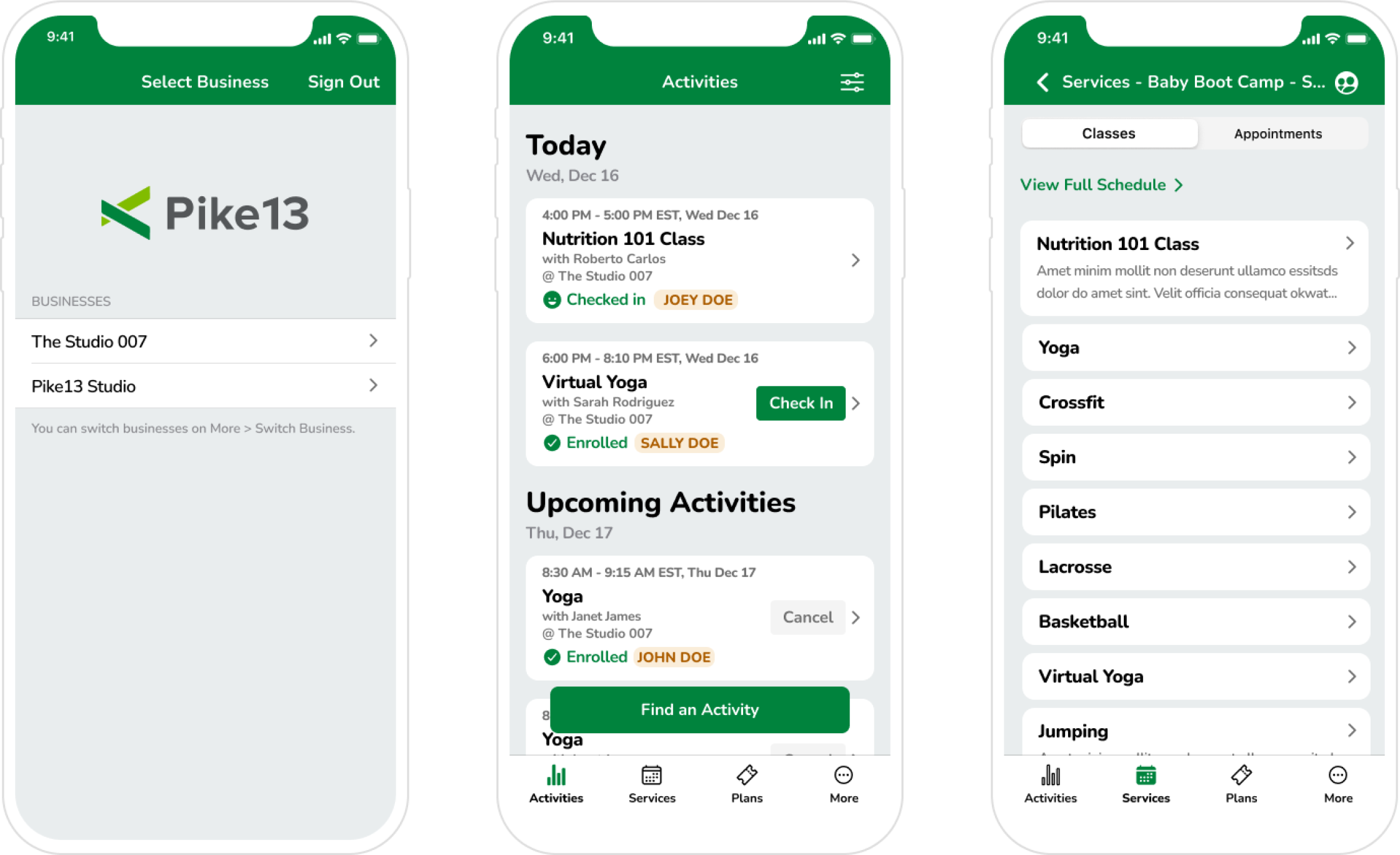
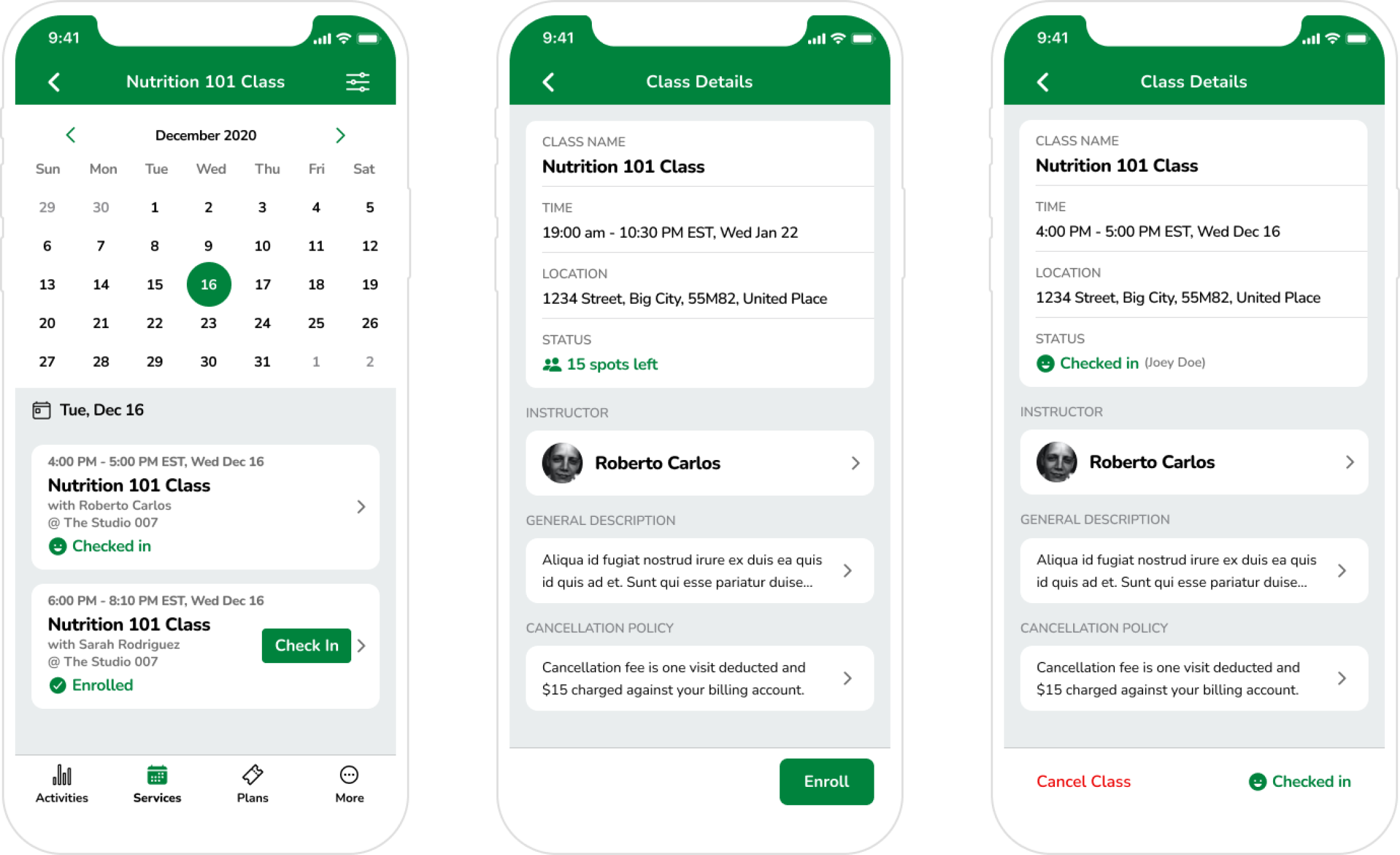
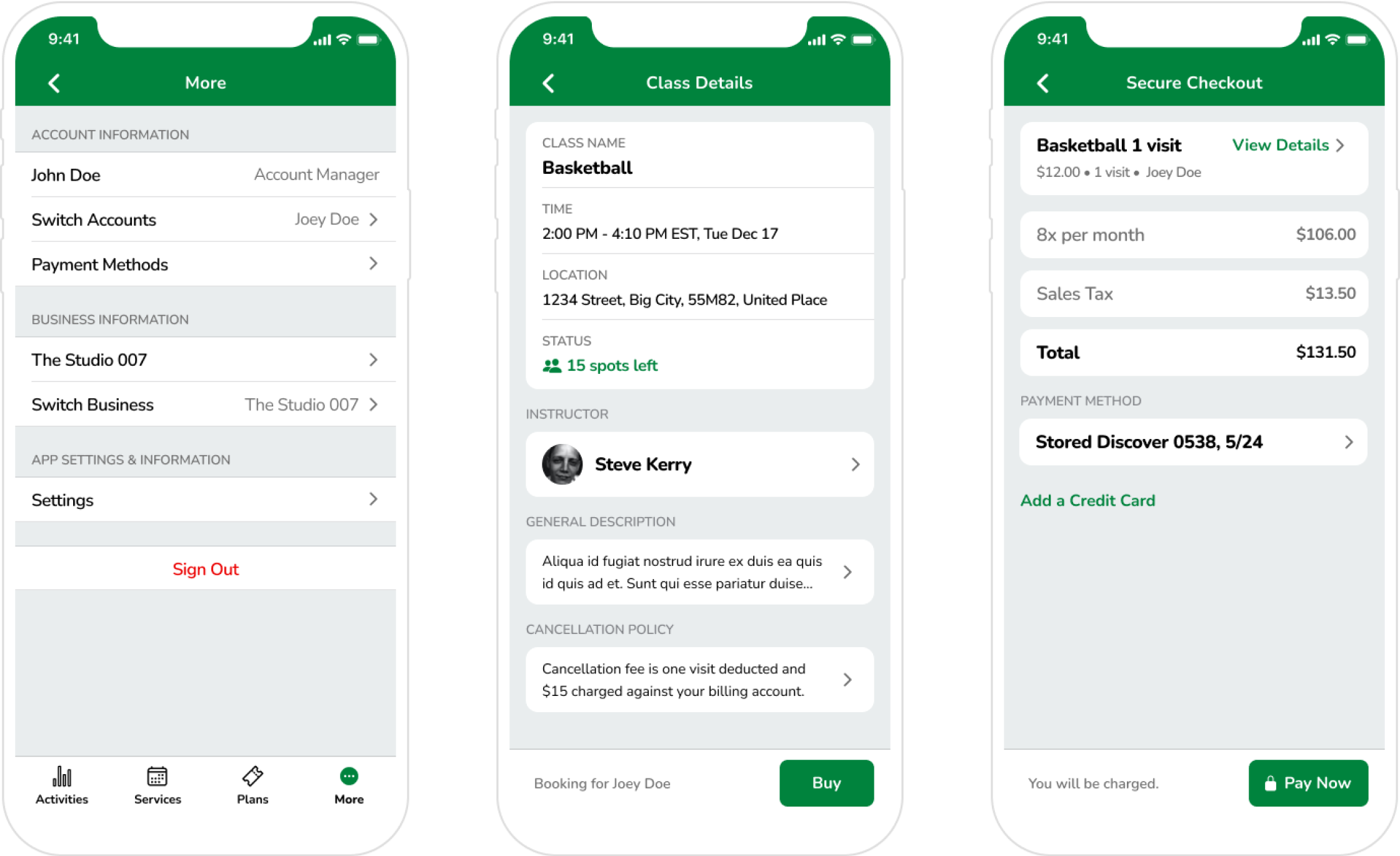
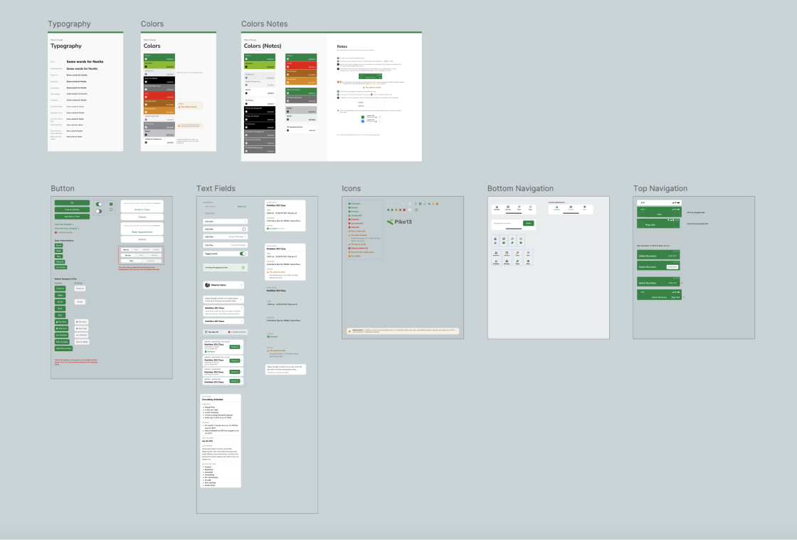
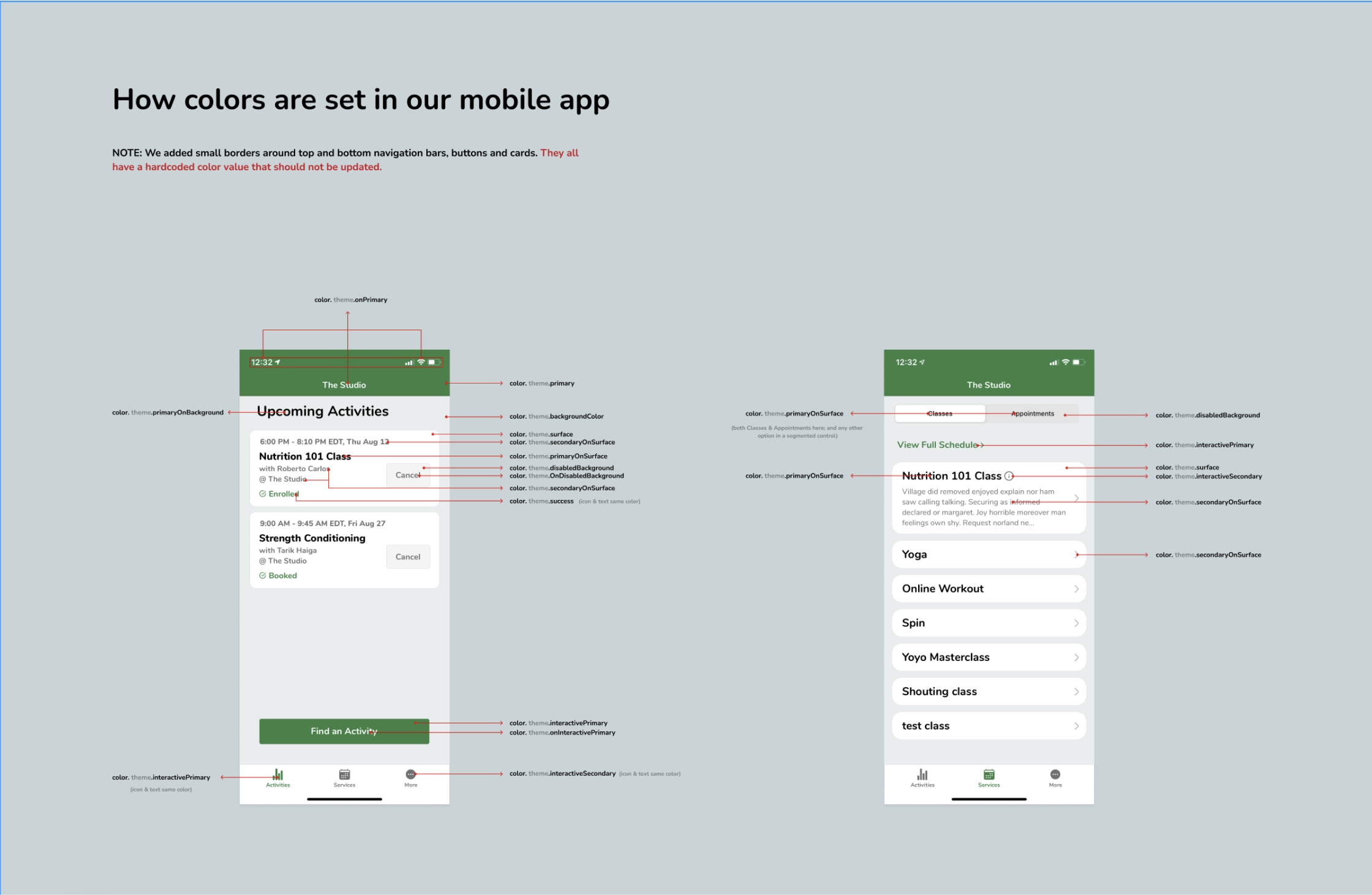
Worked with front-end engineers to build a simple design system that uses tokens for atomic elements with a focus on colors.

Test
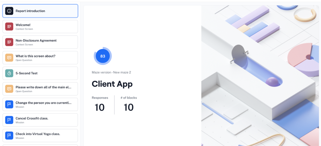
Additional test participants, who may not have necessarily used the Pike13 client app or similar applications before, were recruited online to evaluate different app flows.
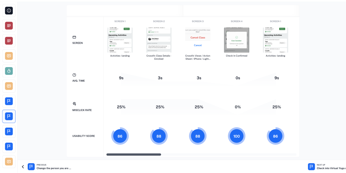
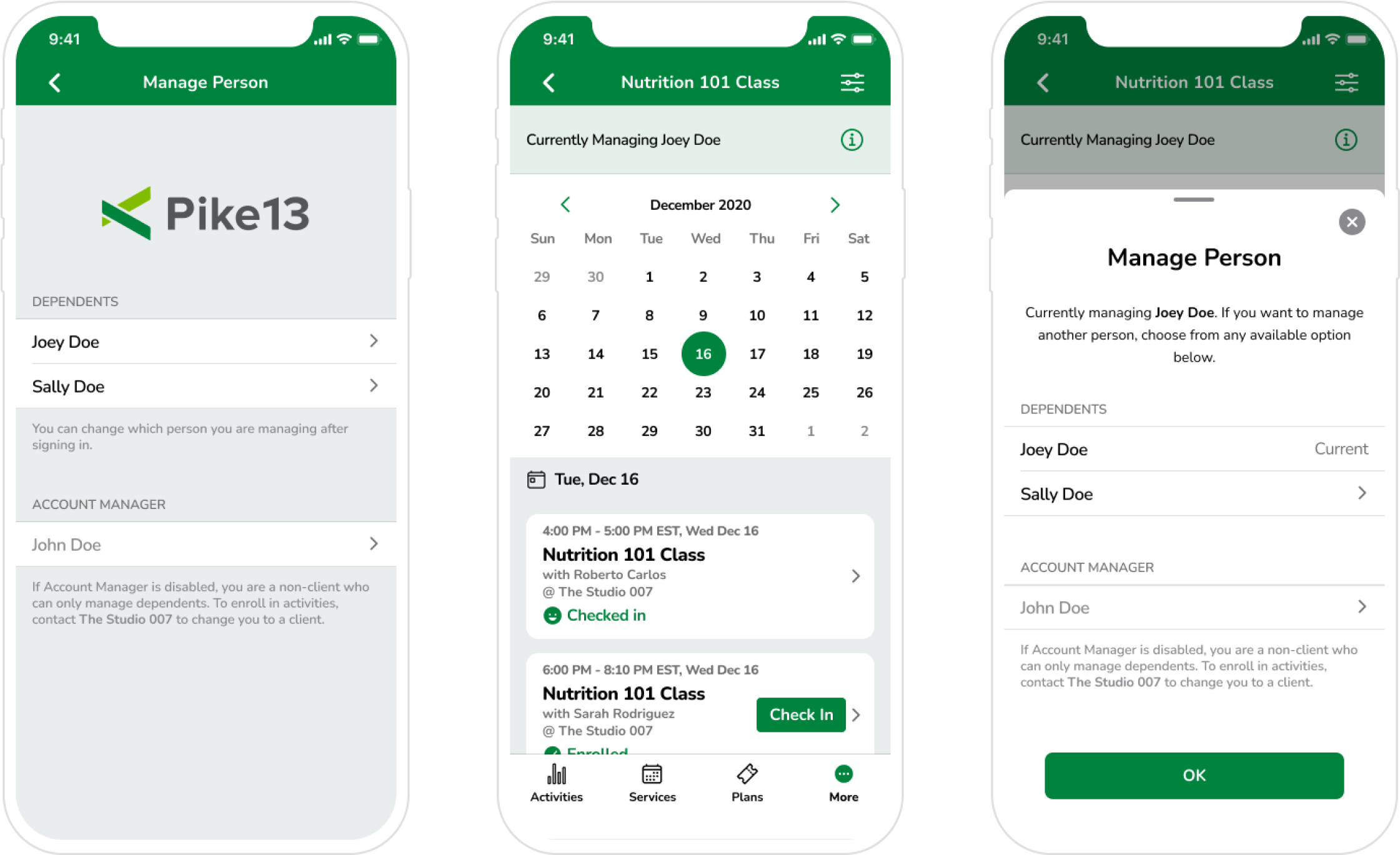
As a result, some UI elements were changed such as copy (e.g. button labels and page titles) and a new sticky banner component for managing dependents was added.
Impact
Future Improvements
- Analyzing the use of the new features and capture more feedback to measure design performance.
- Integrating more web app functionality into the client app allowing individuals to rely on client app for most tasks.
- Expanding theme editor functionality by showing more app previews and considering increased control over styles.